
By: Jeremi Karnell, CEO
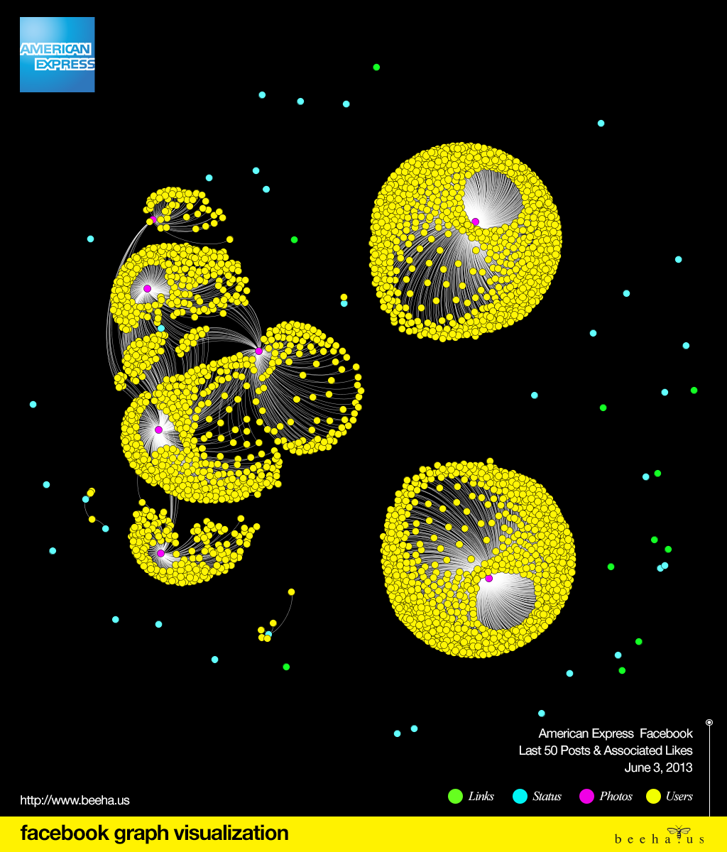
This week’s Facebook Graph visualization exercise focused on American Express. Analyzing the last 50 Facebook posts and corresponding likes, beehaus generated an interesting view of how American Express’ community engages with their content. The below graph represents 3,197 nodes and 3,284 edges. As with the analysis performed for Pepsi and BMW USA pages, photos are the primary content that drive user engagement for American Express.
Clearly visible, in the illustration below, are three clusters of content that received the most likes from American Express’ Facebook community. The cluster on the left represents 5 posts that were associated with the US Open. The cluster on the top right was related to a promotion for the Miami HEAT and their White Hot HEAT Road Rally during the Eastern Conference Finals. The cluster on the bottom right represents American Express promoting advanced concert ticket sales for the Eagles.
What is unique with this visualization is that the community that liked one category of content did not like the other two categories of content. That’s to say; those that engaged with the US Open promotions did not engage with the Eagle’s or Miami Heat promotions and visa versa. This is most likely a result of geographic context and differences that exist between the golf community, basketball community, and music community. That said, we still found it interesting that there was not a single person that sat between any of the three clusters.
Contact Us Today to learn how Graph Marketing can help your business engage your customers in meaningful ways that produce real results.
Pingback: Converse Facebook Graph Visualization - beehaus - Beehaus
Pingback: Facebook Graph Visualization: MTV - Beehaus
Pingback: Facebook Graph Visualization: Golf Digest - Beehaus